Brand Design
LAVA Leander.
Brand identity for a hookah lounge and café in Cedar Park, Texas. The owners were starting from scratch and knew what they wanted to be, but not what it should look like. Positioning, visual direction, the mark: all of it was open.
The Concept
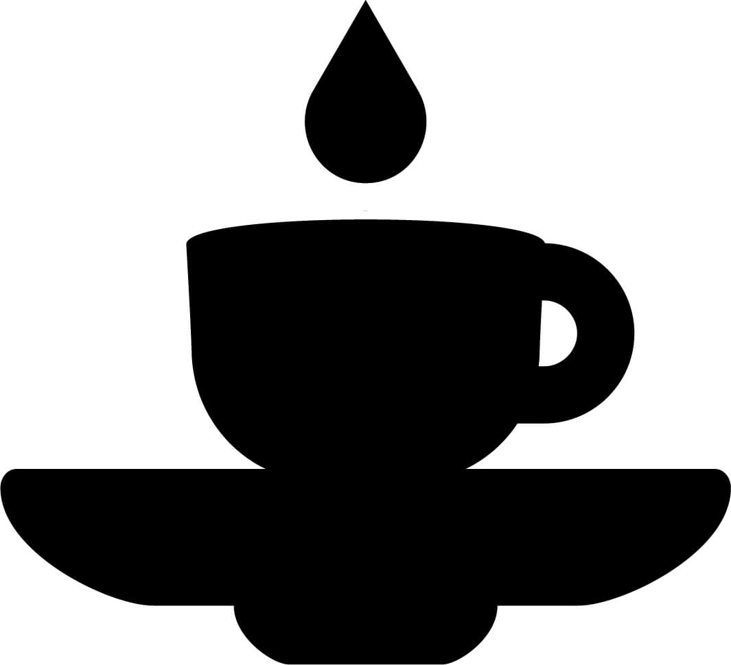
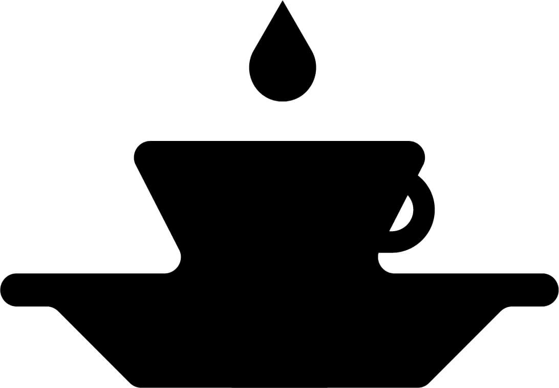
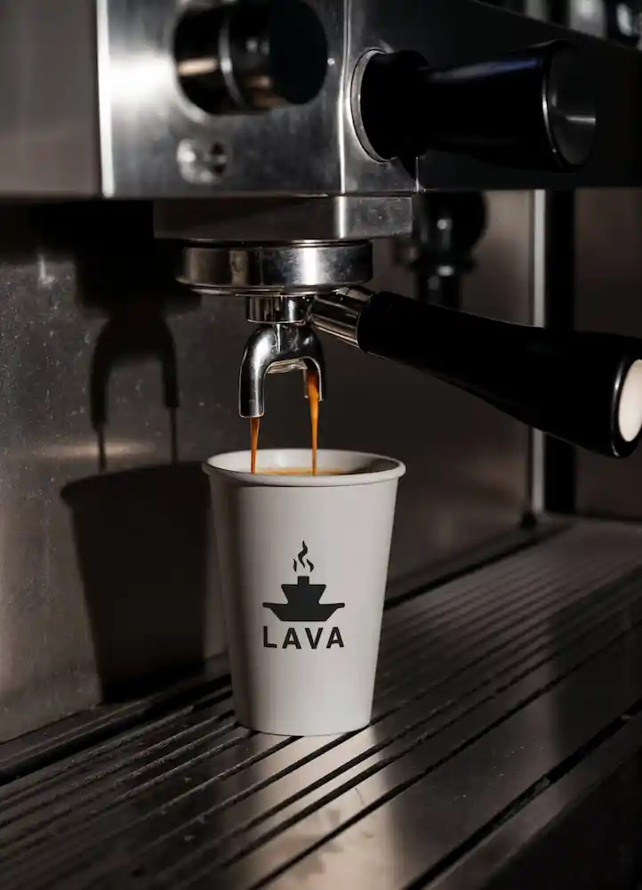
Two things that are already the same shape.
The top platter of a hookah pipe looks almost identical to an espresso saucer. That's the whole mark. One silhouette that reads as both, with no layering and no explanation required.
The owners had a concept and a location but no brand direction, so the visual language had to do that work too. Black and dark maroon because the place is a lounge, not a coffee shop. It should feel a little serious.


Process
Many ideas, one direction.
The first round of sketches went wide. Illustrated hookah pipes, type treatments where the hookah shape became a letterform, integrated wordmarks, abstract vessel forms. Most of them tried too hard to announce what the place was.
The shift was stopping trying to combine the two things and looking for where they were already the same. The cup-platter-as-hookah-saucer read was right there.
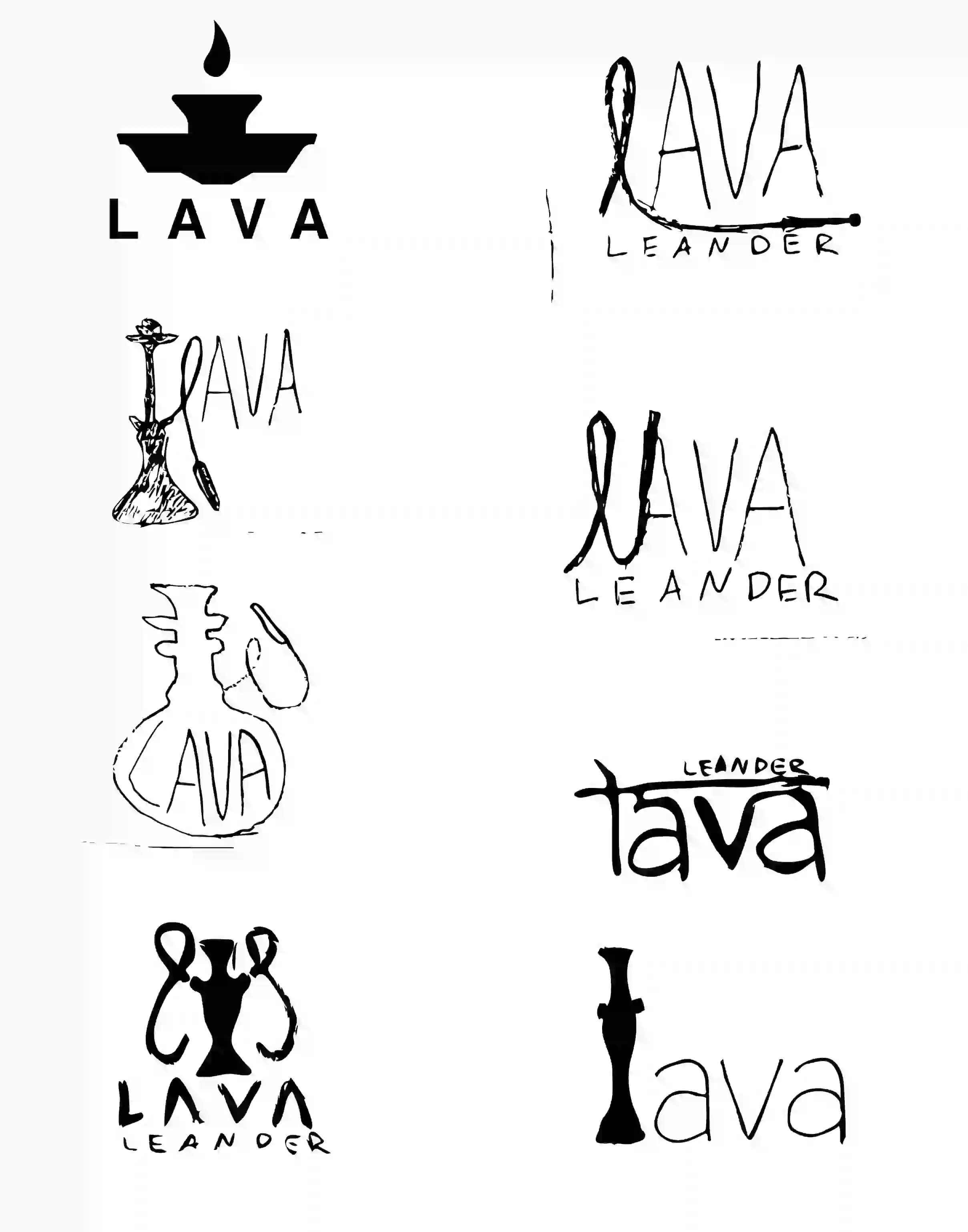
Thumbnail sketches. The range runs from literal hookah illustration to type-driven approaches to abstract integrated marks. Most were eliminated for being too illustrative or for trying to explain the concept rather than embody it.
With the concept settled, the next question was proportion: how much cup, how much platter, how the stem element sits between them. Three directions, each shifting that balance.
Concept refinement. Different ways of showing the same idea — testing how the form could express the dual nature of the space before committing to a direction.
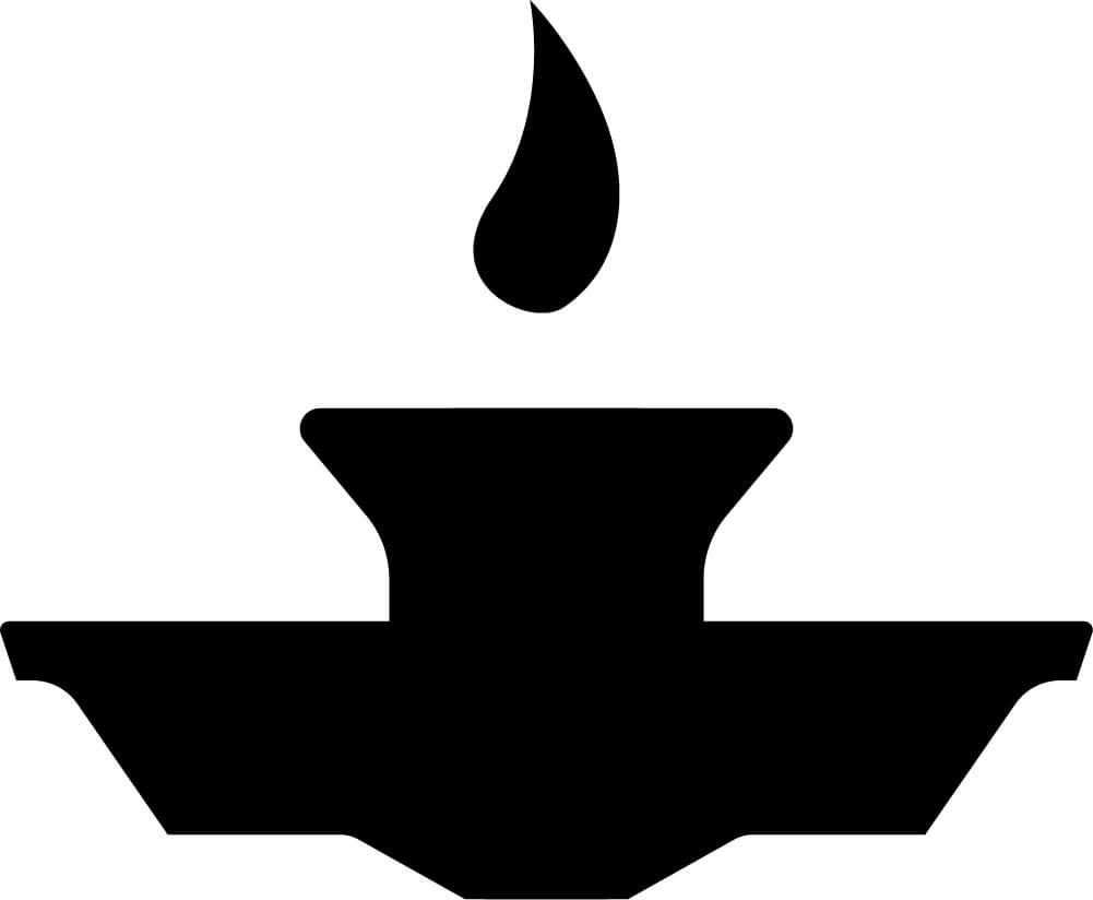
Once the mark shape was locked, the element above the cup became the decision. Six shapes tested across the flame-to-smoke spectrum.
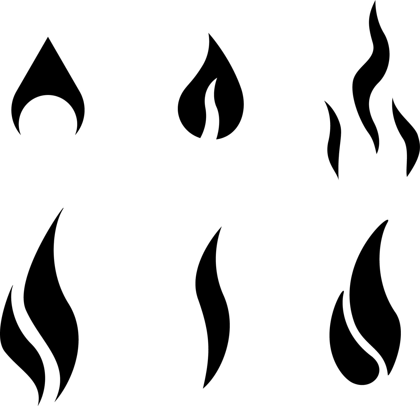
Flame and smoke explorations. Testing different shapes for the element above the cup — how much it reads as fire versus steam, and how ambiguous it could stay.
The typeface decision followed the same logic. Six options across weight and case. The high-contrast serif in the top row earned it on stroke variation alone.
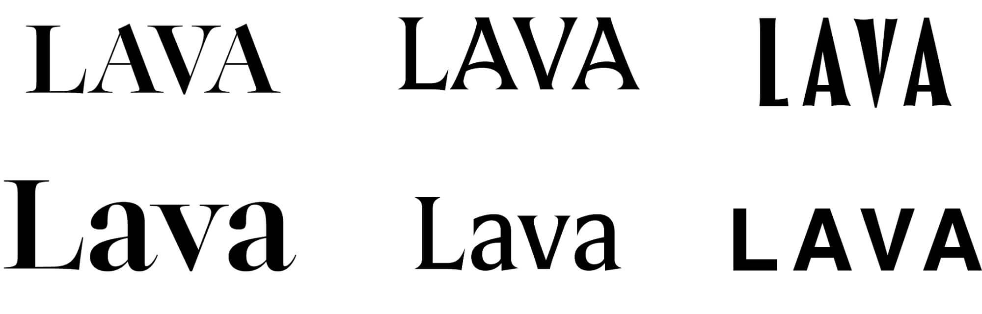
Type explorations. Six options testing weight, contrast, and case — finding a typeface that could sit next to the mark without competing with it.
The System
Three lockups. Every background covered.
The system covers three arrangements: icon and wordmark together as the primary lockup, wordmark-only for tight horizontal spaces, and icon-only for small applications. Each exists in color, black, and white.


Two colors. The near-black carries the wordmark and mark body. The dark maroon is reserved for the flame. It's the only element in the mark that carries warmth. That restraint is intentional.
Charcoal
#2D2B2B
Deep Maroon
#4C1514
White
#FFFFFF
In the World
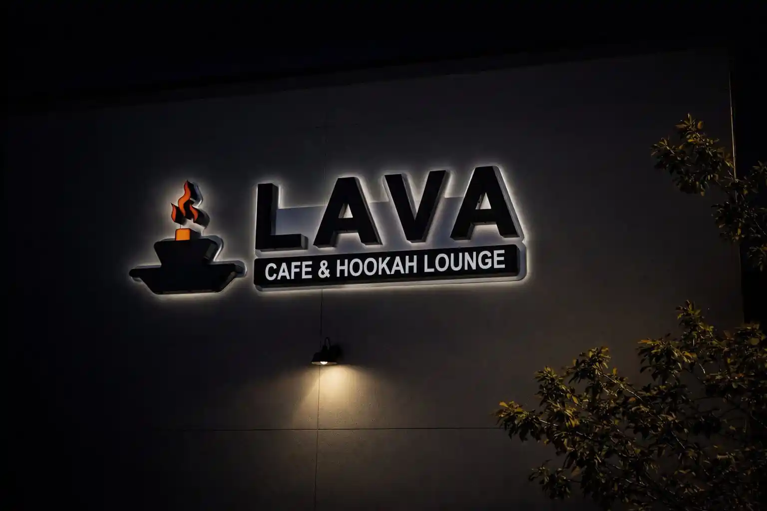
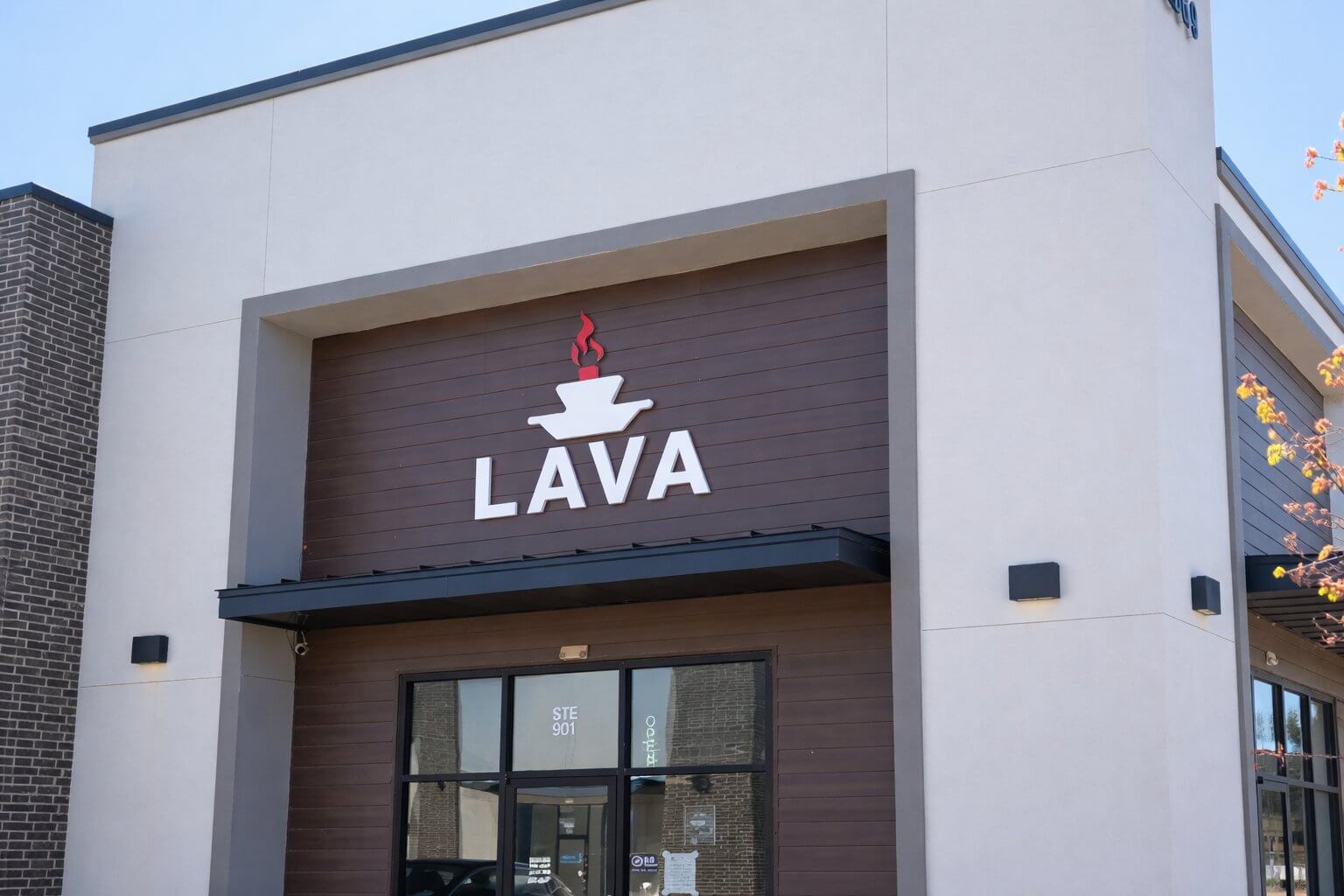
It's on the building.
The mark went from a Figma artboard to a fabricated sign on a commercial building in Cedar Park. Working with the sign company on specs, material decisions, and installation was a different kind of education than anything screen-based.
Reflection
First client. A few things I won't forget.
This was my first freelance project. The design work was manageable. Working with a client for the first time was not.
They picked the one I liked least.
You design for the client's business, not your own taste. Once I understood that the mark they chose actually worked for their context, the preference gap stopped mattering.
Communication is half the work.
First-time business operators don't always know how to give design feedback. Asking better questions and translating vague reactions into a clear direction mattered more than any individual design decision.
Handing off a design is its own skill.
A file that looks right in Figma is not a file that's ready to fabricate. Working with the sign company on specs, color mode, and material tolerances made clear that the design doesn't end when the visual does.