The Problem
A logo that couldn't decide what it was.
The original Capital Candy Jar logo had all the right ingredients and none of the cohesion. There was a Capitol building icon, a candy jar, a star, and an American flag swoosh dropped into a corner for good measure. Each element pulled in a different direction. The type was heavy, the composition was crowded, and the overall effect was busy without being interesting.
The assignment was clear: modernize the brand. Make it feel like somewhere you'd actually want to go. The goal wasn't to keep what existed and tidy it up. It was to find the real concept and build from there.
The original logo. Lots of elements, no clear hierarchy.
Process
Thumbnails first. Then thumbnails again.
The process started with a stack of quick sketches, trying to find a concept worth developing. Early directions explored candy jars, wrapped candies, stars, and eventually eagles. None of them clicked on their own.
The break came when the two biggest threads merged: the bald eagle for the capital, the candy store's actual product. A chocolate-covered strawberry as the eagle's body. Wings and tail feathers off the strawberry, eagle head on top. The concept was specific to this business in a way that a jar or a flag never would have been.
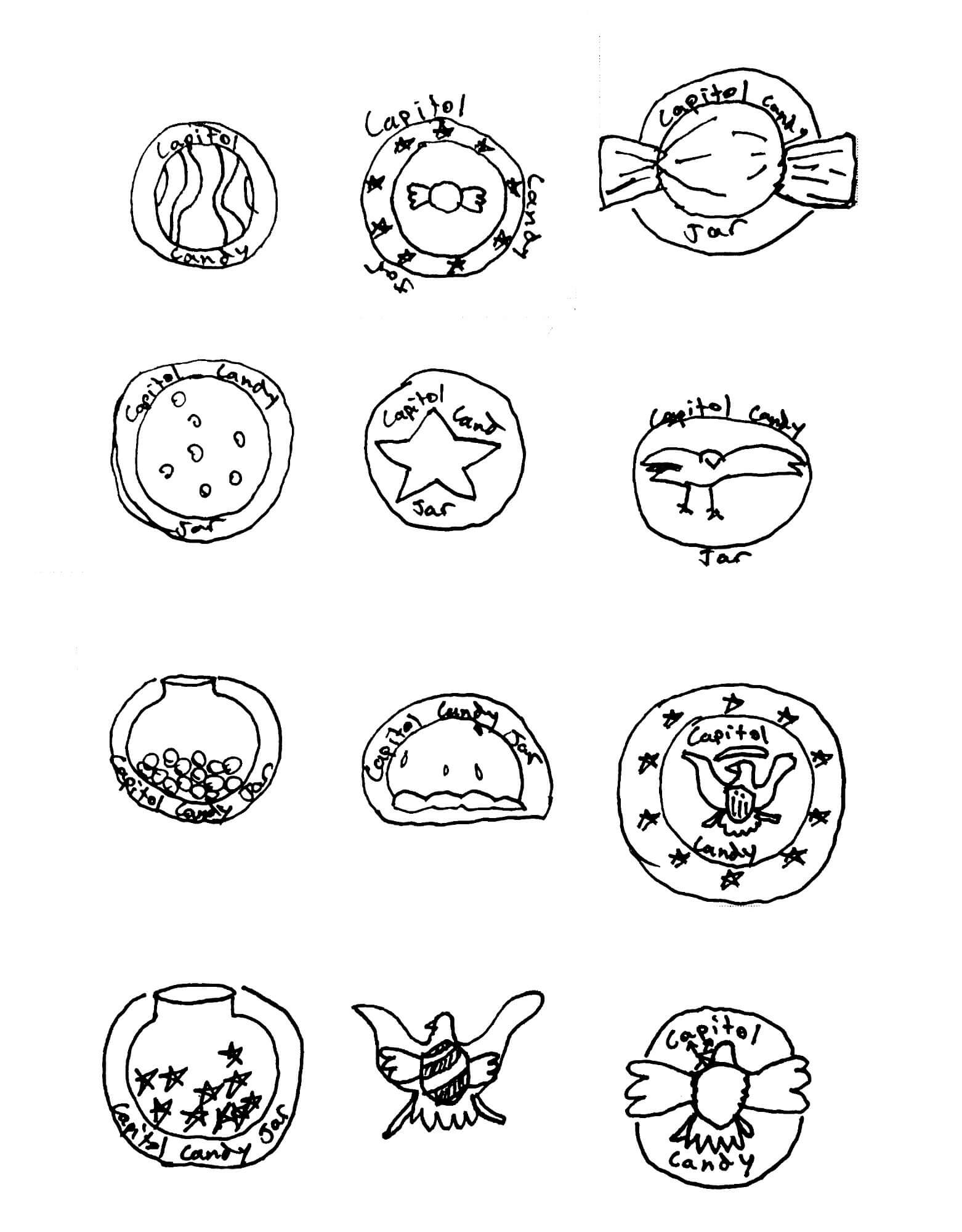
Early thumbnails. The eagle concept starts to emerge in the bottom row.
The first digital versions took the concept too literally. Too many details, too many colors, talons holding a lollipop, a banner across the top. It read like a band logo or a T-shirt graphic, not something that could live on a storefront or a business card.
Thumbnail Refinement
The concept locked in sketch form.
First Digital Attempt
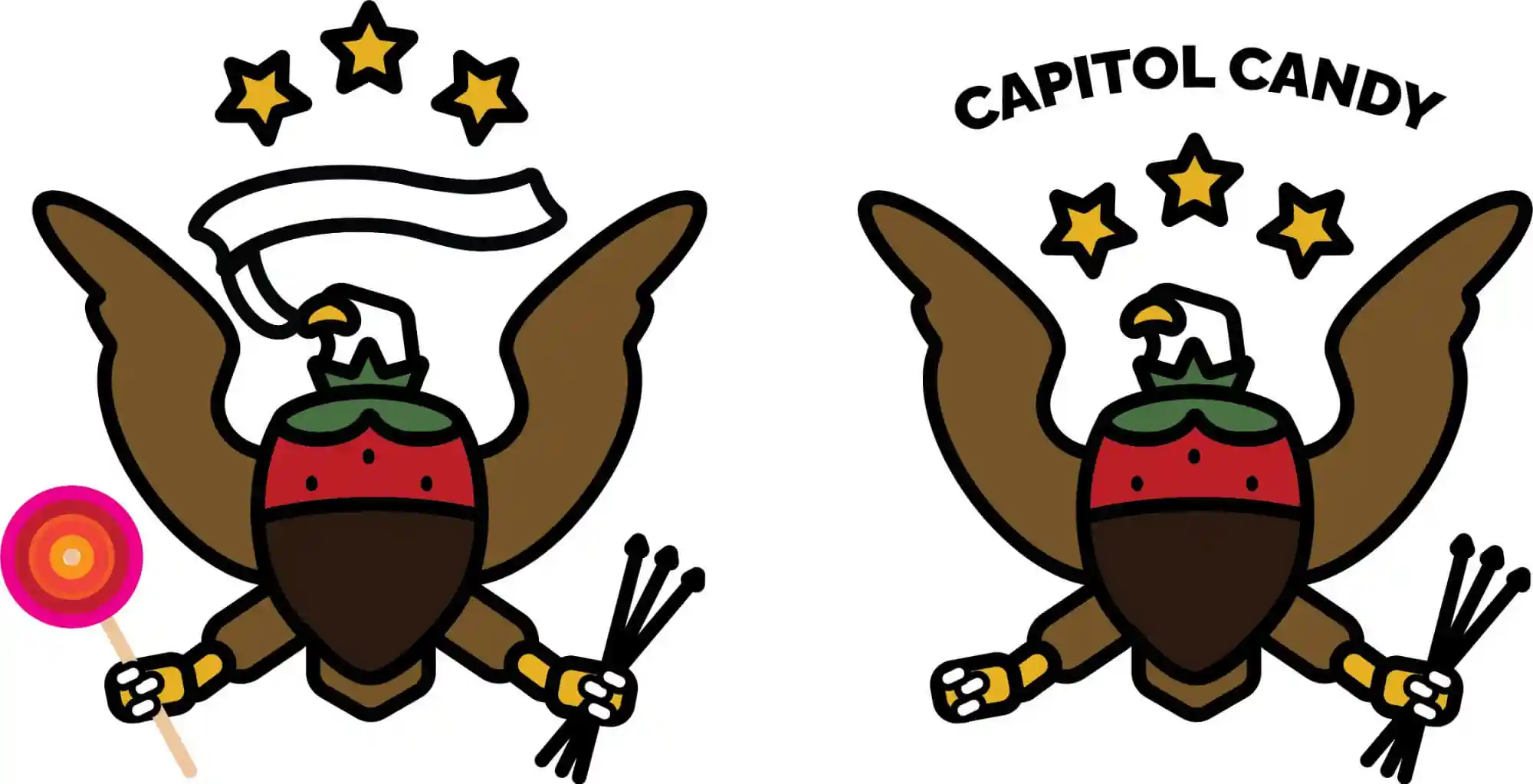
Good concept, wrong execution. Too detailed to function as a logo.
The problem was that a logo needs to work small. At favicon size, at embroidery scale, printed on a bag. All that detail collapses. So the direction shifted: keep the concept, lose the illustration. Build it from simple, symmetrical shapes that hold together at any scale.
A significant amount of time went into the wings and tail feathers specifically. The simplified forms needed to read as both feathers and an eagle in silhouette without leaning on detail to do the work.
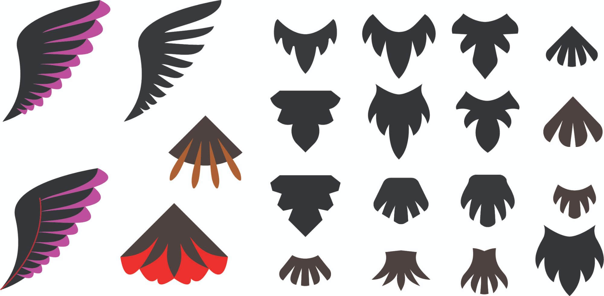
Wing and tail feather explorations. The goal was a form that read as feathers without needing to illustrate every one.
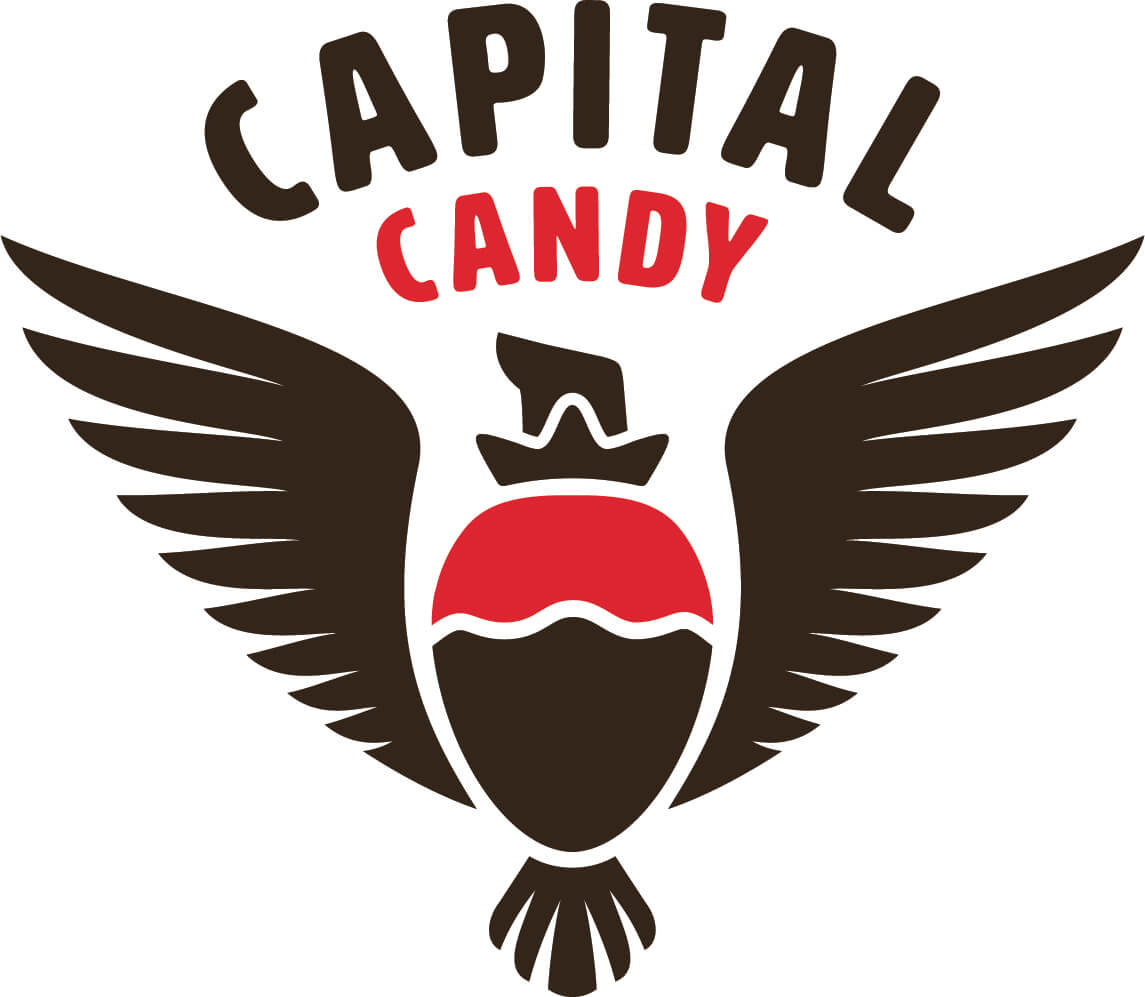
The Mark
Simple enough to scale. Specific enough to remember.
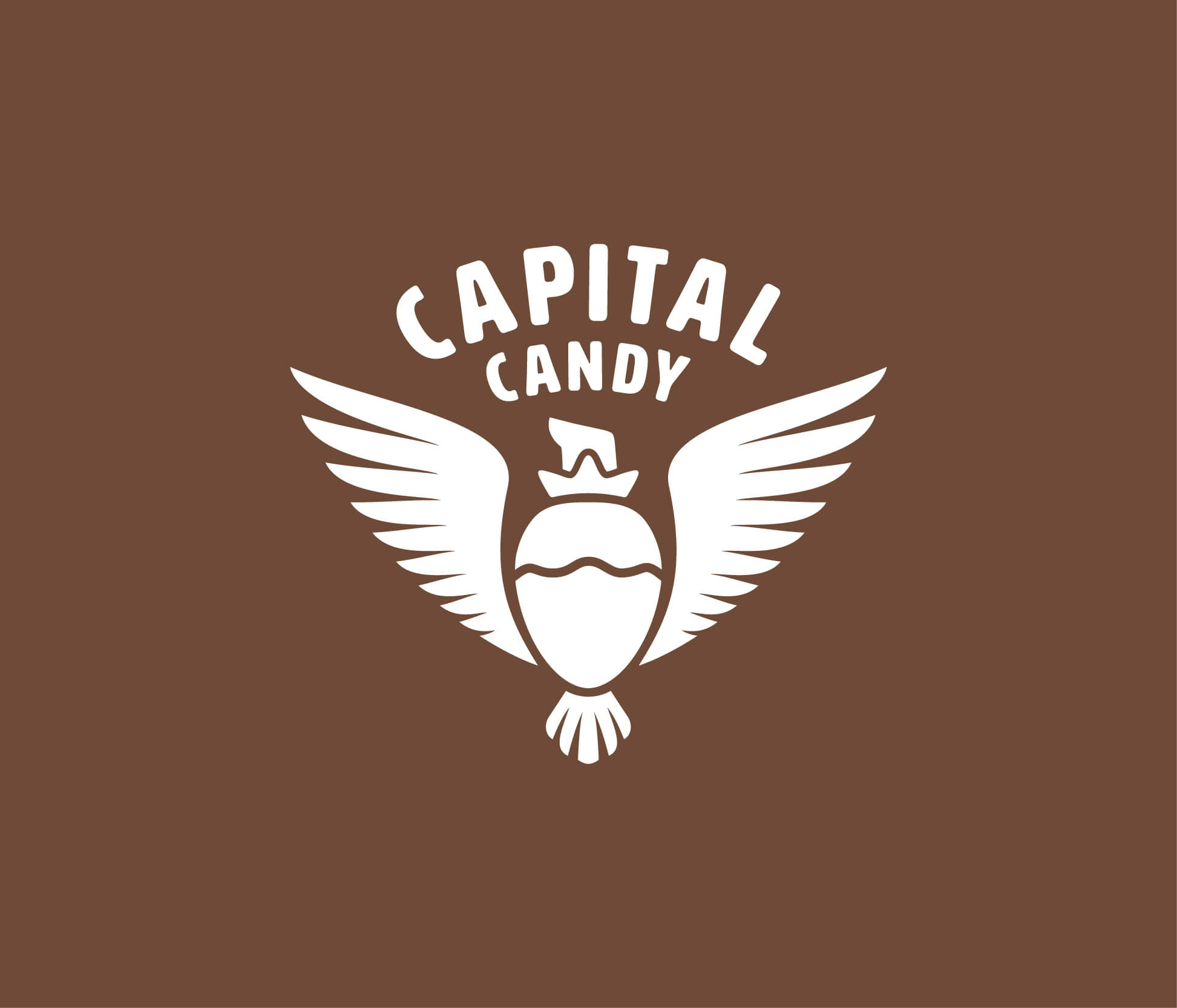
The final logo is symmetrical and mark-first: a chocolate-dipped strawberry body at the center, spread eagle wings on either side, and the eagle's head on top. The strawberry's rounded form creates the natural silhouette of a bird in flight. The wordmark sits in an arc above, set in HWT Artz, a typeface with enough weight and personality without tipping into novelty.
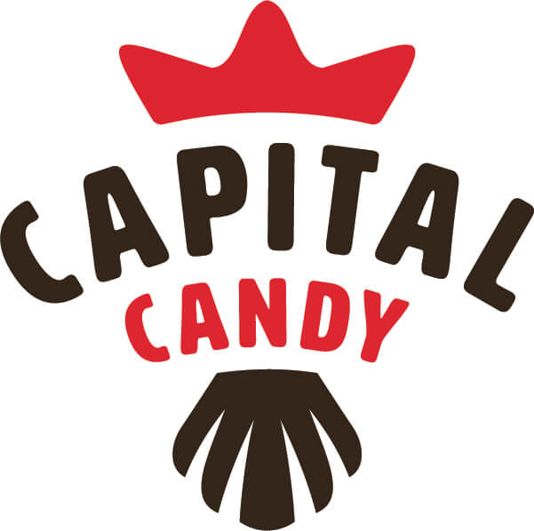
A condensed alternate mark handles small applications. Same concept, compressed for caps, pins, or anywhere the full mark wouldn't fit.
Primary mark and compact alternate. Both use the same shapes. The alternate strips back to the essential read.
Color & Type
Pulled straight from the subject matter.
The palette came directly from the concept. Dark feather brown from a bald eagle, strawberry red from the fruit itself, and a lighter milk chocolate tone that bridges the two. Nothing arbitrary.
Feather
#3f332a
Strawberry
#db4553
Milk Chocolate
#6d4b38
Hover each swatch to see the name and hex value.
The typeface is HWT Artz, a display face with enough character to match the mark without competing with it. Set in an arc, it gives the logotype the kind of lockup that works on a sign, a bag, or a storefront equally well.
Variations
One mark, multiple contexts.
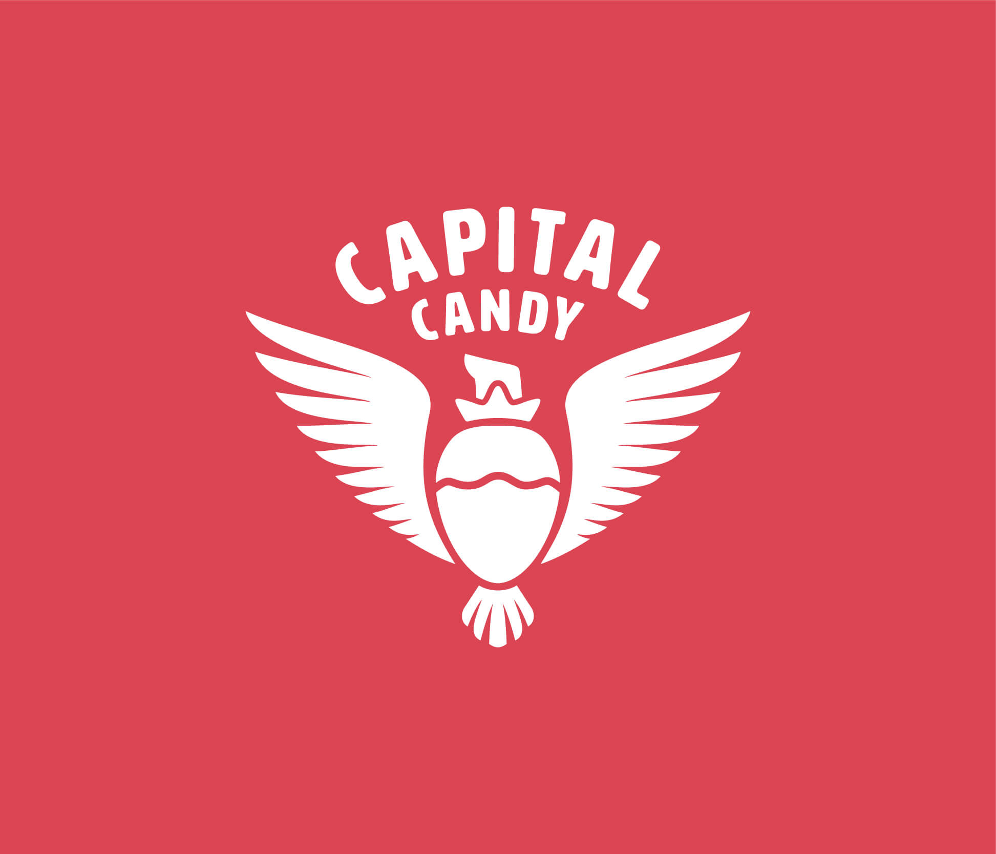
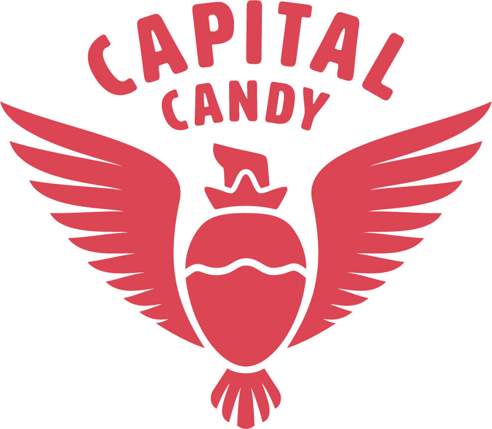
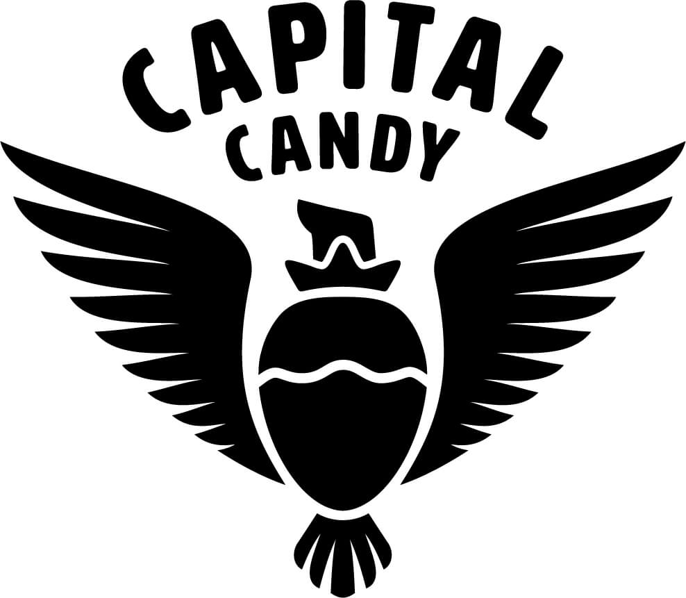
A logo needs to hold up in situations you can't always predict. These variations cover the core use cases: brand color backgrounds for packaging and apparel, a single-color silhouette for print, and a standalone red version for light surfaces.
On Red
On Brown
Red on White
Black Silhouette
Reflection
What this project taught me about logos.
This was one of my earlier logo projects, and the biggest thing it clarified was the difference between illustration and identity design. The first round of digital work looked fine at full size. It fell apart at any other size. A logo isn't a graphic you zoom in on. It's something that has to communicate instantly, at a distance, in one color if necessary.
The concept has to do the work
The strawberry-eagle merge worked because it was specific and earned. Two symbols that independently made sense for this brand, combined into one form. That's the kind of concept that holds up over time.
Simplicity is a technical constraint, not an aesthetic preference
Logos live at small sizes, in one color, embroidered, printed on packaging with no budget. The simplification from the first digital round to the final mark wasn't about taste. It was about function. The detail had to go because it wouldn't survive real use.
Recognition means something when you earn it the hard way
The project won Graphis New Talent Gold. For a student project, that was real confirmation the concept landed beyond the classroom. More than the award, working through why the first direction failed was the part that stuck.