The Brief
Redesign an existing brand's identity. I picked the one that already inspired me.
The assignment was open-ended: choose a real company, research it thoroughly, then rebuild its visual identity from the ground up. Equator Coffees was an easy choice. Their existing identity is clean, flat, and confident. A simple single-color mark in a category full of emblem logos and badge-style lockups. It already stood apart. That's what caught my eye, and that's what I wanted to build from.
I researched the company first. Founded in 1995 in San Francisco, they became an early Fair Trade partner in 1999 and eventually opened their own farm in Panama. The more I dug in, the clearer the concept became: coffee comes from the equator. The name and the origin story were pointing at the same idea. That became the logo.
Research
Every competitor sold coffee. None of them had made ethics the founding identity.
I started by researching the company, then looked at the competition. Most coffee brands were doing some version of the same thing visually: emblem-style logos, circular badge lockups, illustrated marks. Equator's existing identity was doing something different. A single-color mark, clean and flat. That restraint was already saying something about the brand, and I wanted to carry that sensibility into the redesign.
The ZAG analysis sharpened the strategic direction. Equator's "only" was clear: the only coffee shop dedicated to ethical sourcing from day one. The whole identity system needed to feel as honest and direct as that positioning. I would have gone deeper on competitive research if the timeline had allowed it, but the core direction was evident early.
The ZAG question that grounded everything: "What is your only?" Equator's answer became the lens for every decision that followed.
Christopher
24 — Paralegal, San Francisco
Goals
- Fast coffee on the way to work
- Consume without contributing to exploitation
Frustrations
- Slow service
- No visibility into where his coffee comes from
Alyssa
30 — Waitress, San Francisco
Goals
- Minimize her footprint
- Support brands that are honest about their supply chain
Frustrations
- Working class people exploited behind the scenes
- Companies that market ethics without practicing them
The Trademark
Coffee comes from the equator. The mark says that directly.
The original Equator Coffees mark is a red puma, flat and single-color. Confident and clean. It inspired the direction. What I wanted to explore was whether the mark could say something more specific about where their coffee comes from.
The concept came together early. A globe plus a coffee bean, two shapes that merge into one mark. It's a simple idea because the truth behind it is simple: coffee grows in equatorial regions, and Equator Coffees sources from them. The name and the origin story were already pointing at the same place. I just made that visible.
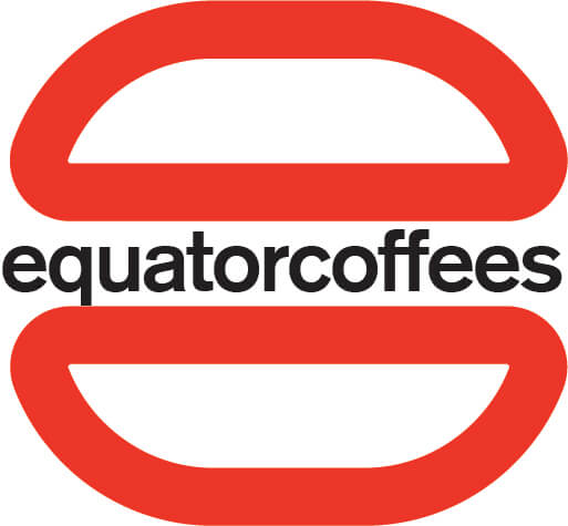
Original mark. The puma is strong and clean. It inspired the flat, single-color approach carried into the redesign.
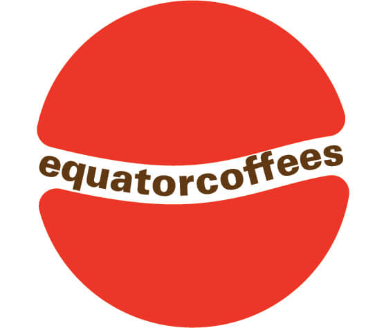
Redesigned mark. Same flat red language, new concept rooted in the brand's origin story.
Getting the concept was the easy part. The actual construction took much longer. I work to make logos clean at the vector level: no extra anchor points, no sloppy curves, no shortcuts. Getting the proportion right between the two halves, the space in the center where the wordmark sits, the way the type locks into the equator line took real time.
Five iterations. The C concept was abandoned early. The stroke-weight experiments narrowed down to a filled form. The type placement and spacing took the longest to get right.

Primary mark and icon-only variant. The icon strips back to the essential form for small-scale applications like embroidery and tight lockups.
Wordmark for horizontal lockups and large-format applications where the mark isn't needed.
Color & Type
A palette pulled directly from the product and the people behind it.
Five colors, each traceable to something real: the roasting process, the bean itself, the industrial feel of specialty coffee spaces. Red-Hot Poker is the dominant brand color, energetic and warm without veering into the commodity-coffee territory that Starbucks green occupies. Crema and Coffee Bean give the system light and dark neutrals rooted in the product.
Hover each swatch to see the name and hex value.
Typography pairs two faces: Rodfat Two for headlines and display use, heavy and confident with enough personality to anchor large-format advertising, and Menca for body copy and supporting text, which brings a softer counterpoint. Together they balance authority with warmth.
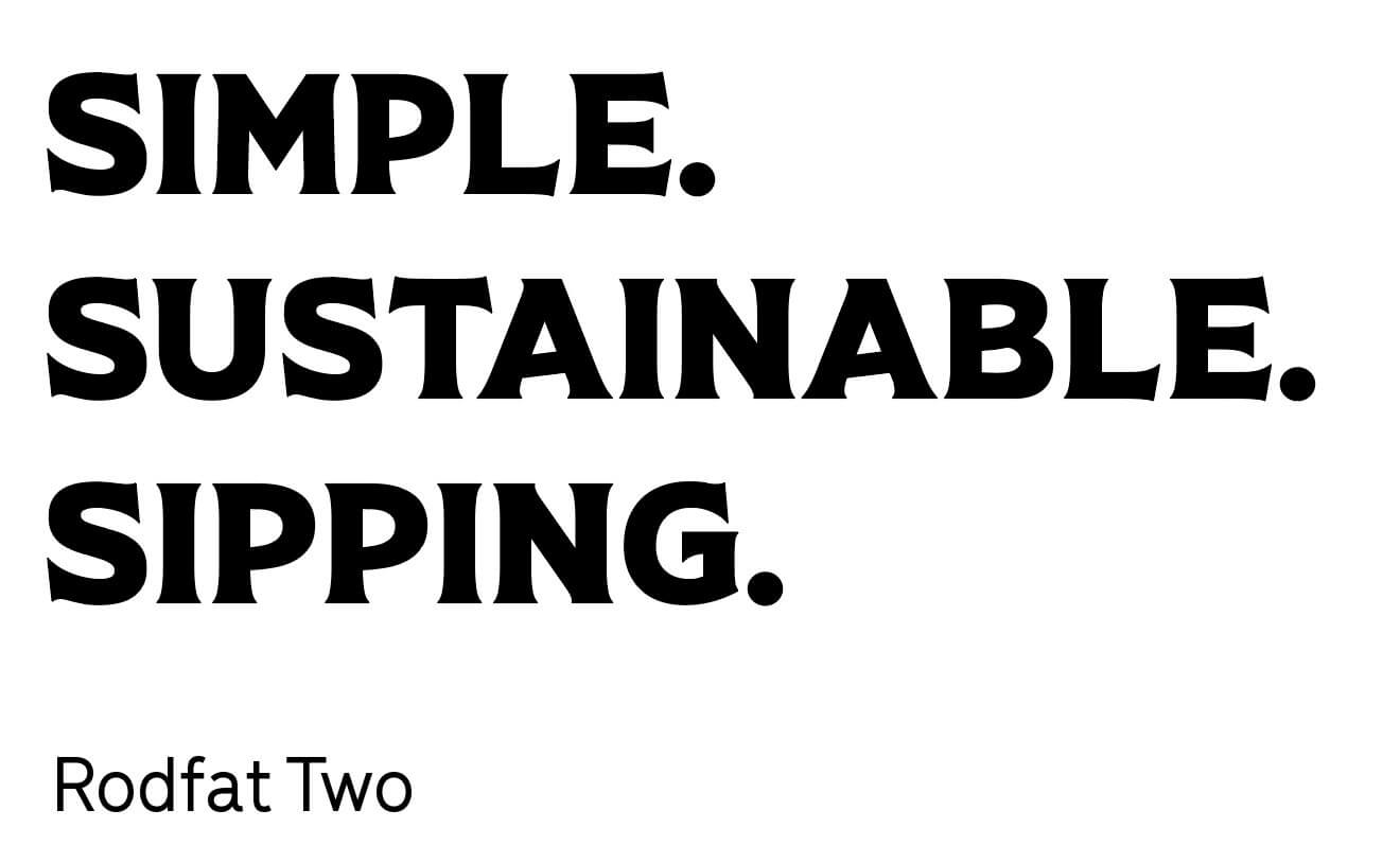
Rodfat Two for display and headlines. Menca for body copy and secondary text.
Applications
The mark had to hold up everywhere: a can, merch, a billboard.
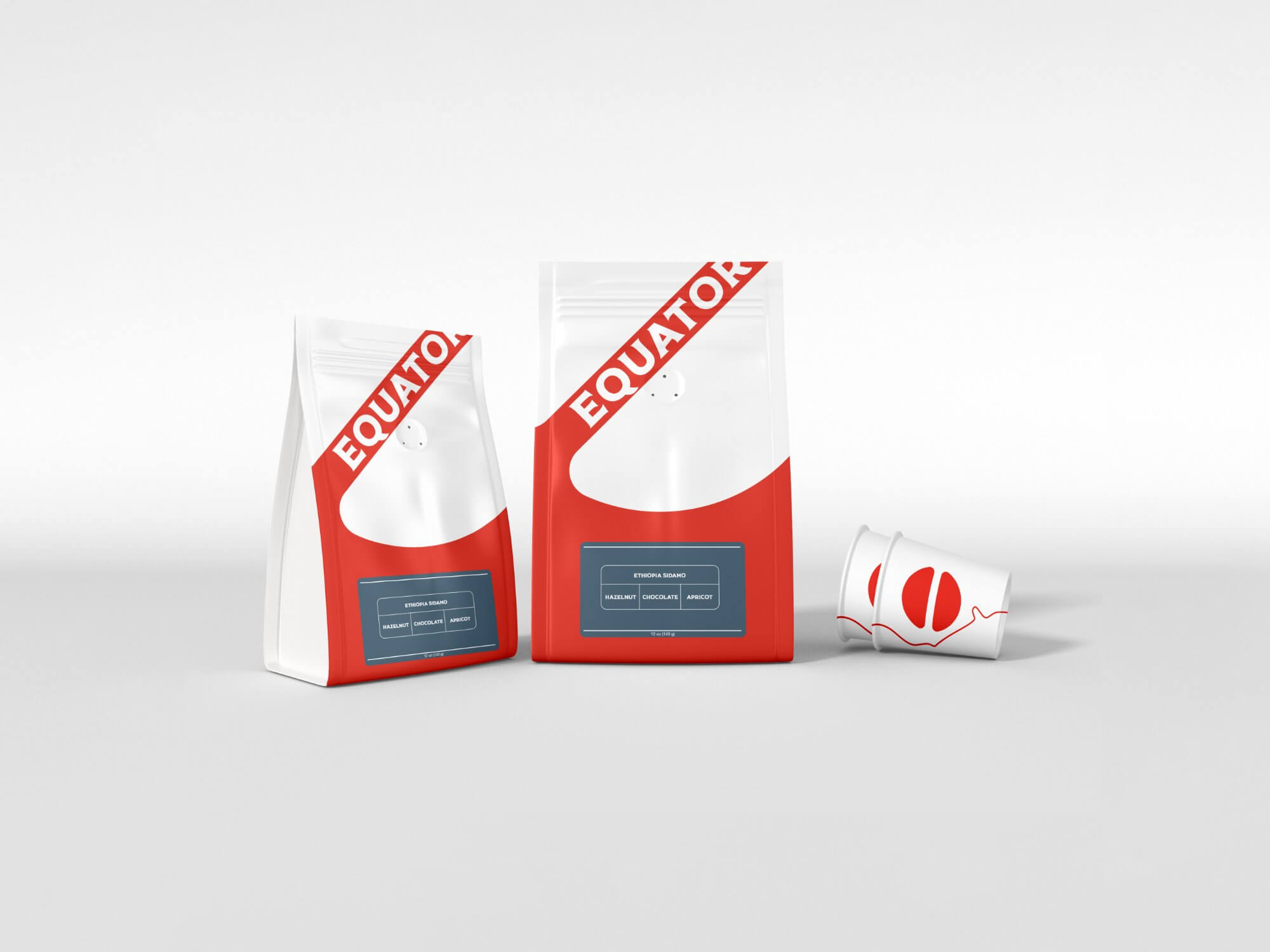
The mark means nothing in isolation. This section put it to work: retail packaging, a canned product line, out-of-home advertising, and merch. One simple mark across all of it without losing its shape.
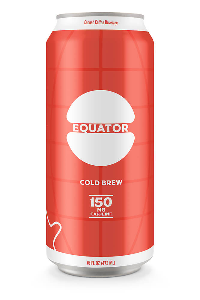
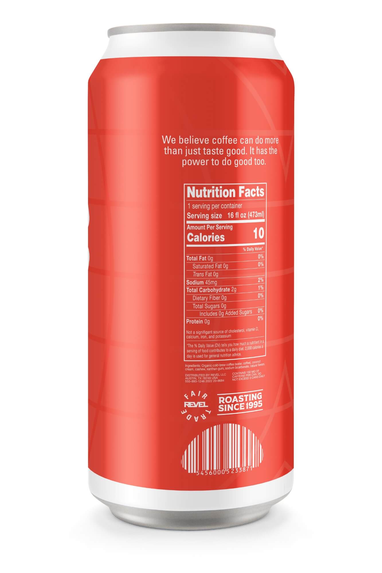
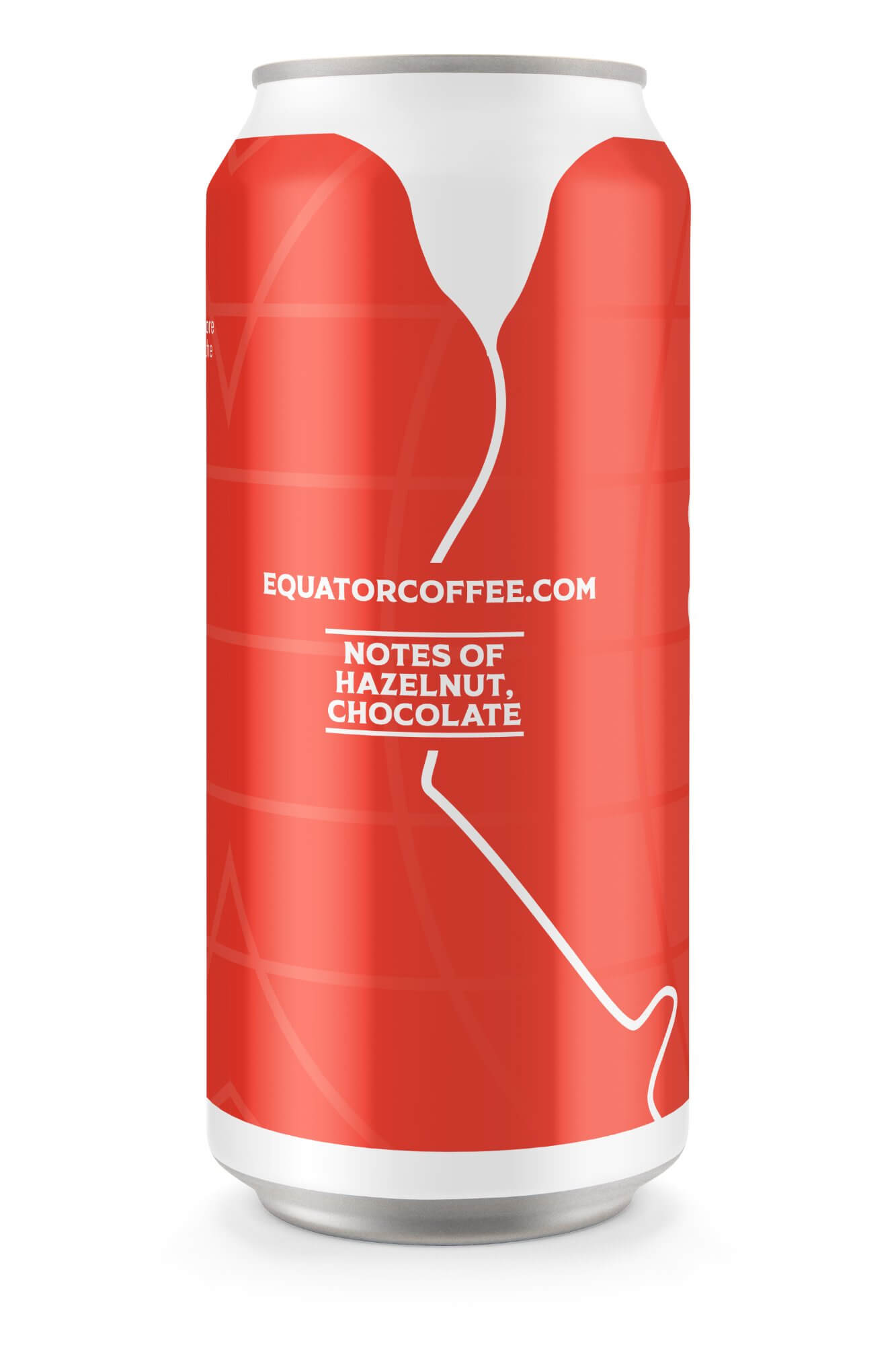
Cold brew can, front, back, and side. The globe grid appears as a secondary texture on the can surface. The equator line wraps around as a wayfinding element on the side panel.
Whole bean bags in two sizes and a branded cup. The mark scales down cleanly to the cup format.
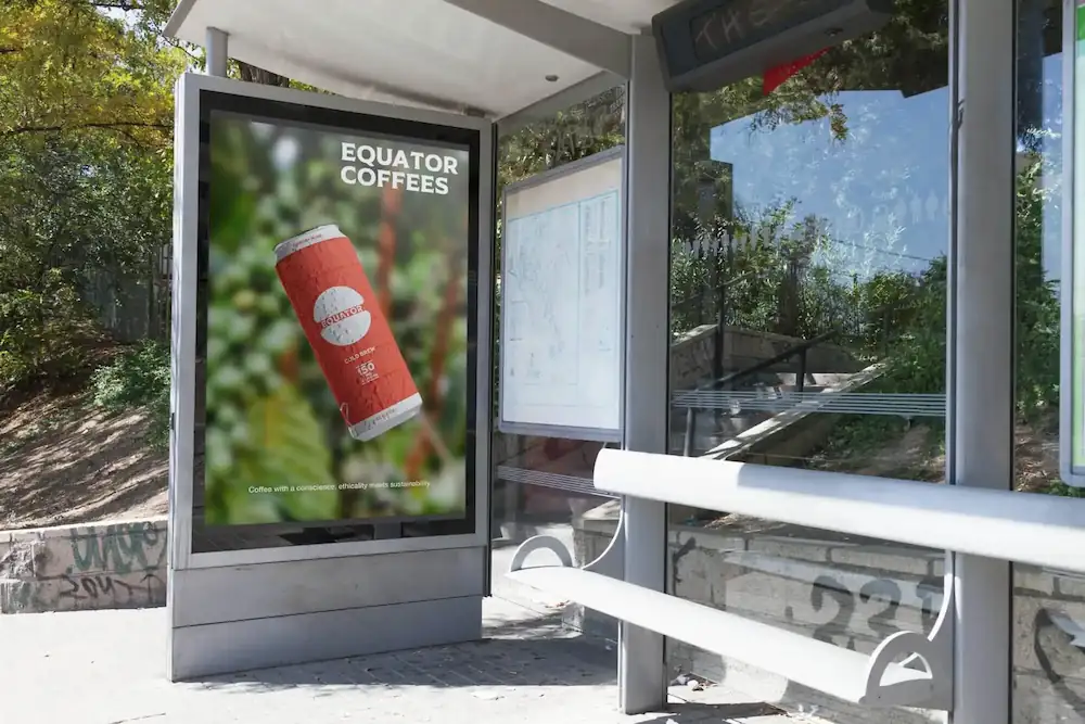
Out-of-home advertising placed in transit contexts, targeting the ethically minded commuter who already lives near Equator's SF locations.
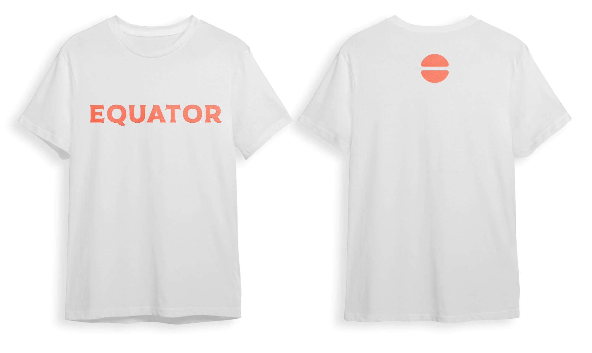
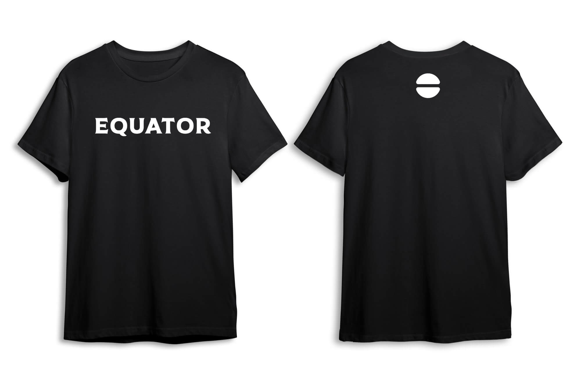
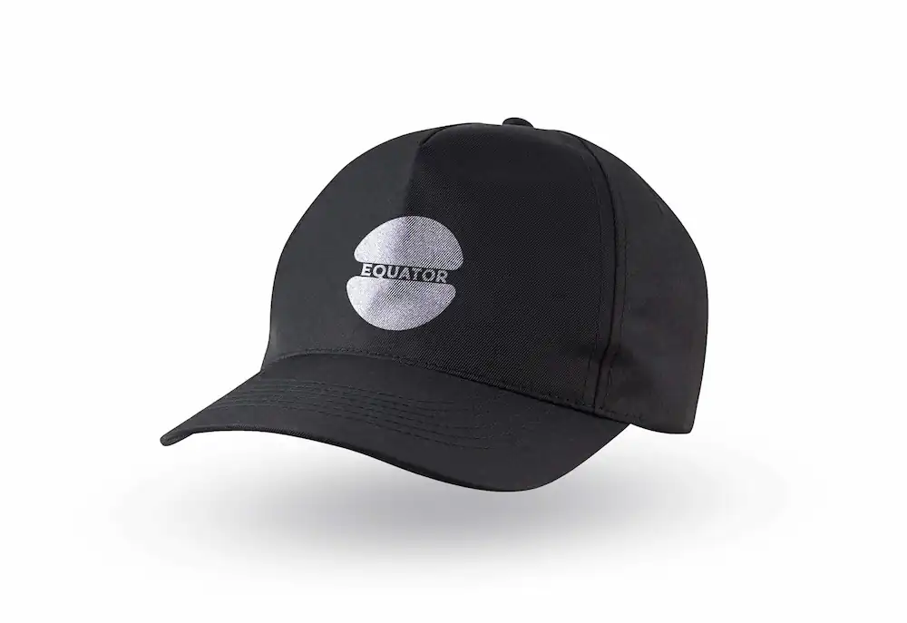
Merch: wordmark on white, wordmark on black, and the full mark embroidered on a cap. The icon-only variant appears on the back of both shirts.
Reflection
The concept was right. The time wasn't enough.
This was a semester project with a fixed schedule: each deliverable had a deadline, and the pace didn't leave room to go as deep as I'd want on any single piece. The logo took the most time and got the most attention. The strategy was solid. But the application work moved faster than I'd like.
If I came back to this, I'd spend more time on the logotype and typography. Those were the pieces where the time crunch showed most. I'd also do deeper competitive research. I looked at the main competitors but would have benefited from a wider sweep, more context on how specialty coffee brands were positioning themselves visually in 2023.
The core identity holds up. The mark is clean, the concept is clear, and the palette works. For a brand that's genuinely doing something worth designing around, that's where the time needed to go.