Initial Conception
Getting together shouldn't require a group chat spiral.
The three of us had all felt this firsthand. You want to see your friends. You suggest a day. Half the group is busy, someone suggests a new time, replies trickle in over two days, and by the end you either pick a bad time that not everyone can make or the whole thing quietly falls apart. The problem wasn't people not wanting to hang out. It was that coordinating with a group had too many steps, too much back-and-forth, and no single place to land.
Existing tools weren't solving this well. General calendar apps are personal by design. When You Work is built for shift scheduling, not casual plans. Group chats are where coordination goes to get buried. We wanted to build something purpose-made for the one specific thing: getting a group of friends to agree on a time to meet up.
The Challenge
Everyone wants to spend time with the people they care about, but coordinating schedules across a group is often difficult. A simple platform for friend groups to check mutual availability and lock in a time, without the overhead of a full calendar integration, is what's missing.
The Goal
Create a mobile app that lets groups of friends quickly create events, share availability, and schedule the right time to meet, while keeping personal calendar details private.
Research
Why is it actually difficult for people to meet up with friends?
Before touching a wireframe, we ran a survey to identify where the real problems were and understand what features people already expected from a scheduling tool. Over 50 respondents gave us the signal we needed to move forward with confidence.
View Survey Responses (opens in new tab)50+
respondents across age groups and social situations
#1
pain point: conflicting schedules and slow communication
Top
expected features: shared calendar view and availability sync
Three takeaways shaped the design direction.
- Conflicting schedules, slow back-and-forth, and individual time constraints were the main barriers to making plans. Not lack of interest.
- People expected comprehensive scheduling and calendar tools, but had strong concerns about sharing full calendar access with friends.
- There was a clear appetite for a lightweight middle ground: something that signals rough availability without exposing personal details.
What this told us
Privacy was the constraint that would shape every decision. People wanted to coordinate, but they didn't want to hand over their calendars. Any feature that required too much disclosure would be a blocker, not a convenience.
How might we?
These questions helped us reframe the problem from a technical scheduling challenge into a human coordination one.
- How might we help friend groups find common free times without requiring full calendar access?
- How might we reduce the number of messages it takes to agree on a time?
- How might we let people signal availability without feeling pressured or exposed?
- How might we make event creation feel lightweight enough that someone actually starts it?
User Archetypes
Two distinct patterns emerged from the survey data. They represent opposite ends of the coordination dynamic: the person who gets dragged in, and the person doing the dragging. Designing for both meant the app had to work passively and actively.
The Bookworm
Behavior
- Struggles to carve out social time around academic and work commitments
- Feels stressed when coordinating plans adds to an already full plate
- Values efficiency and gravitates toward tools that simplify rather than add steps
Core Needs
- A way to indicate when they might be free without committing upfront
- An interface that doesn't add steps or require manual data entry
- Social features that encourage connection without adding pressure
The Planner
Behavior
- Takes the lead on organizing group events and chasing down RSVPs
- Feels the weight of being the one person keeping things moving
- Wants friends to participate equally in the scheduling process
Core Needs
- Tools that distribute scheduling effort across the whole group
- A single place to propose, adjust, and confirm a time
- Visibility into who has responded and who hasn't
Execution
From wireframes to a decision that changed the whole product.
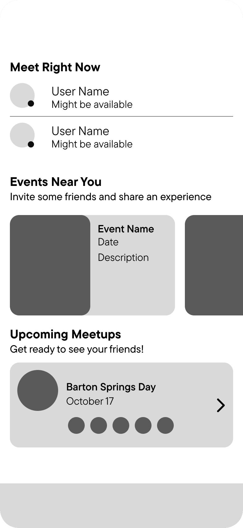
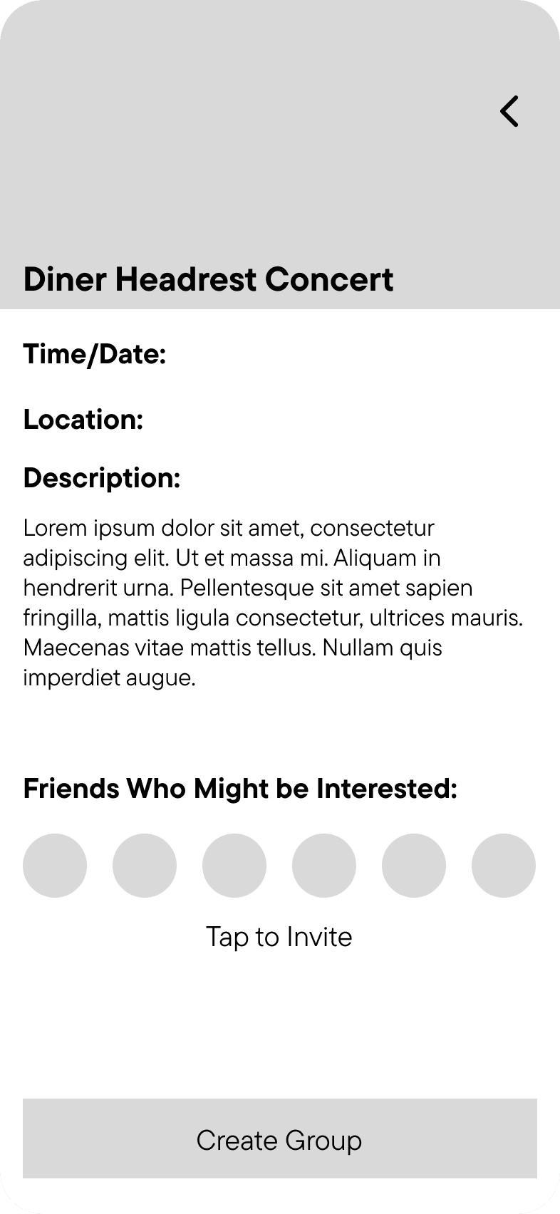
With research complete, we moved into low-fidelity wireframes for a mobile app. Our target audience skewed younger, so mobile-first was a given. The lo-fi phase was about pressure-testing assumptions before investing in high-fidelity work. Three screens anchored the early work: the home feed, the event creation flow, and the event detail view.
Low-Fidelity Mockups
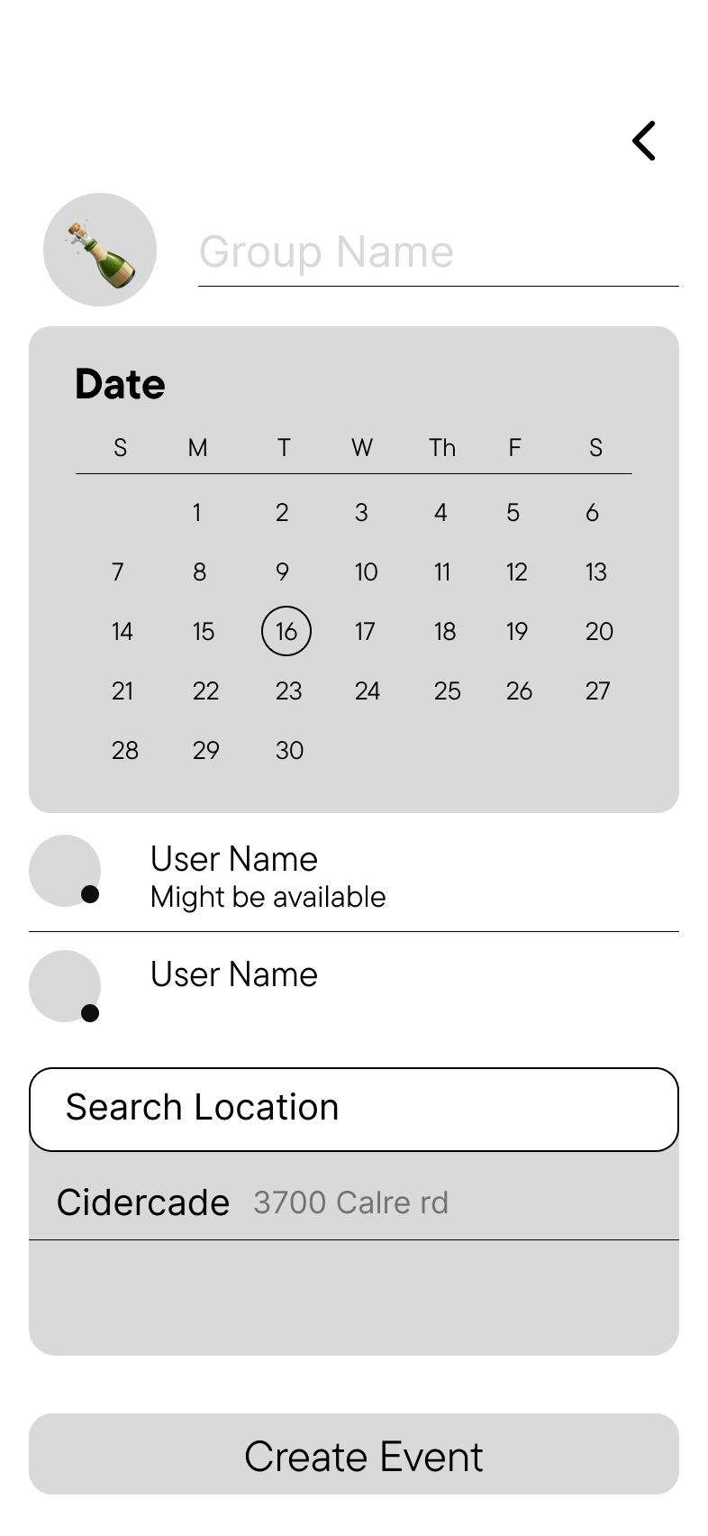
The Pivotal Decision
The original design asked users to input their schedules directly. During wireframe review, this immediately surfaced the same concern our research had flagged: people didn't want to hand over that level of detail. Entering a full schedule felt invasive rather than helpful. We scrapped the idea entirely and replaced it with a "might be available" tag that users could apply to their profile at any time. It communicates rough openness without requiring any commitment or disclosure. That single change made the whole concept feel safer and more honest about what it was asking people to share.
UI and Visual Design
The interaction model was done. Visual design was next. We chose a dark mode aesthetic with bright accents, pairing a clean sans-serif type system with high contrast to keep things legible and energetic. The app needed to feel social and alive.
Typography
TT Commons Pro
Ag
ABCDEFGHIJKLMNOPQRSTUVWXYZ
abcdefghijklmnopqrstuvwxyz
0123456789
Ag
ABCDEFGHIJKLMNOPQRSTUVWXYZ
abcdefghijklmnopqrstuvwxyz
0123456789
Ag
ABCDEFGHIJKLMNOPQRSTUVWXYZ
abcdefghijklmnopqrstuvwxyz
0123456789
Color System
Five Colors, Each Doing Real Work
Memory Blue
#47AAE9
Venue Violet
#49323E
Polaroid White
#EDEDED
New Season's Green
#04A777
Summer Orange
#FB8B24
Branding
Logo and App Icon
The blue dot pulls double duty: it reads as a notification badge on the app icon, and as a punctuation mark on the wordmark. The dark background version leads in context where the app is actually seen — phones, dark UIs, app stores.
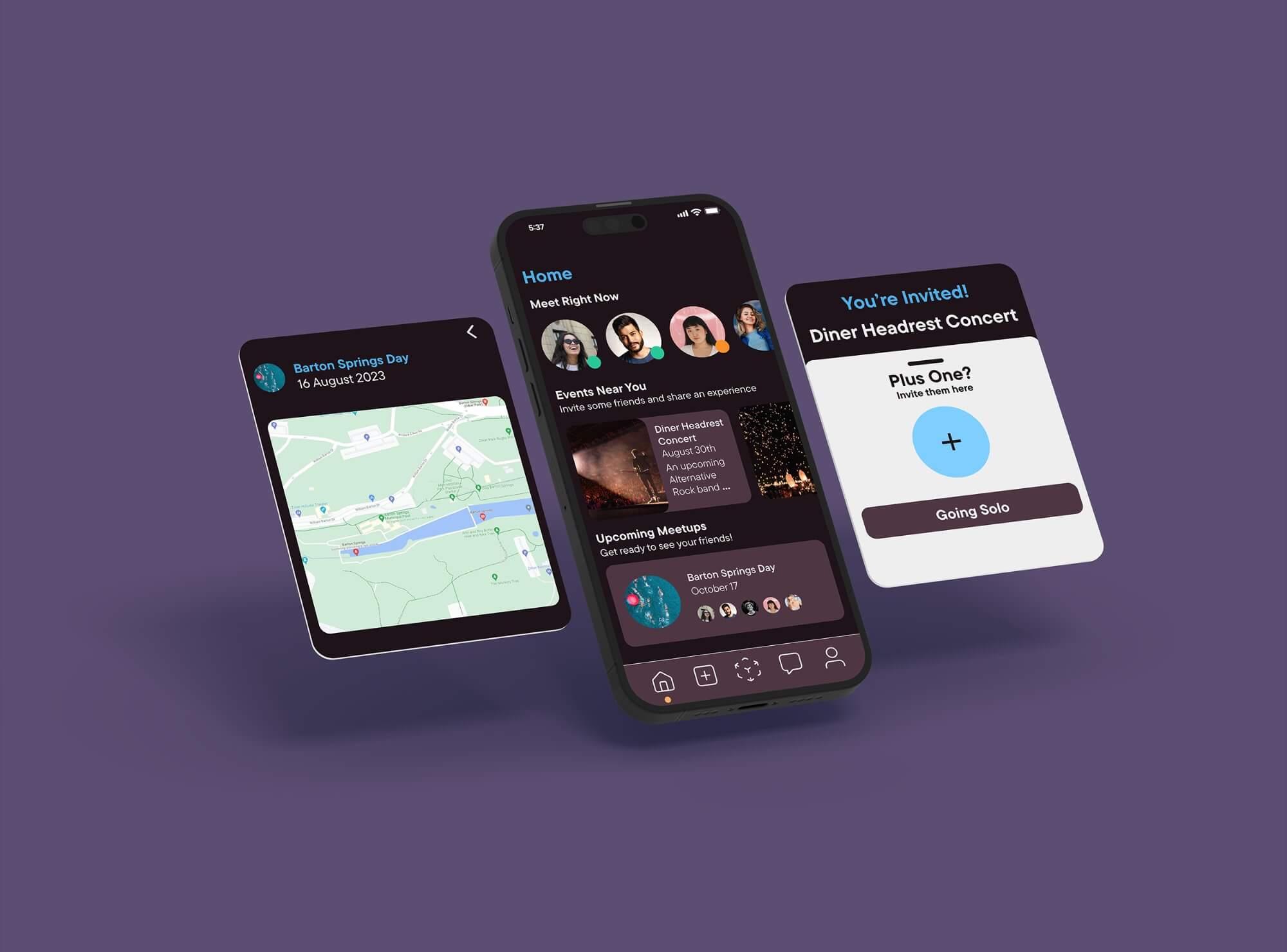
High-Fidelity Prototype
Two flows, recorded from the working prototype. The interaction centers on seeing who's free and creating something around that.
Flow 01
Flow 02
Home and Invite
Event Creation
The home screen surfaces who might be free and what events are already happening nearby. From there, inviting a friend is one tap.
Creating a meetup from scratch: pick a location, lock in a date and time, choose who to invite. The whole flow is designed to feel like three decisions, not a form.
Reflection
What this project taught us about designing for trust.
OpenInvite was a one-month sprint from survey to prototype. The timeline was tight enough that every decision had real consequences. That pressure made the research phase the most important month of work.
Privacy Is a Design Constraint, Not a Legal Checkbox
The single most important decision in the project came from listening to what people were worried about, not just what they wanted. Swapping full calendar input for the "might be available" tag only happened because the research had already told us people were uncomfortable with the alternative. User discomfort is a design signal. It's worth treating it like one on every project.
Lo-Fi Is for Breaking Things, Not Refining Them
The wireframe stage was where the original schedule-input concept fell apart, which is exactly when it should have. Getting to that failure quickly, before any high-fidelity investment, is the whole point of low-fidelity work. Don't make wireframes polished.
Designing for Casual Use Is Harder Than It Looks
Apps like this have to feel lighter than they are. The underlying coordination problem is genuinely complex, but the experience of using the app cannot feel that way. Getting that balance right was the hardest design problem on this project.
Future Improvements
- AI-driven scheduling suggestions based on a user's past availability patterns, so the app gets smarter the more it's used.
- Optional integration with popular calendar apps for one-tap event syncing, without making it a required step.
- In-app group chat scoped to individual events, so coordination stays in one place instead of bouncing back to a separate messaging thread.