Initial Conception
The problem wasn't what people were buying. It was why.
Most people who overbuy clothes aren't shopping because they need anything. They're shopping because they feel like they have nothing to wear, and that feeling is easier to act on than to question. The solutions that exist address the wrong moment: thrift apps and ethical brand directories help people buy better, but none of them interrupt the impulse before it becomes a purchase. What's actually missing is a clear picture of what someone already owns and the confidence that it's enough. I wanted to design for that gap, not the sustainable shopping experience, but the moment before someone opens a shopping app at all.
The Goal
To create an app that allows users to see the clothes they own at a glance, generate completely new outfits based on their style preferences, and save their favorite looks for later.
Research
Why do people spend money on clothes they don't strictly need?
17 responses. The data confirmed the core assumptions. A few responses pushed the thinking in directions the initial brief had not fully considered.
View Survey Responses (opens in new tab)76%
wear trendy items once or twice, then never again
82%
open to a platform that helps resist trend buying
69%
report regretting trend purchases at least sometimes
What drives purchases?
% of respondents selected each factor
Monthly clothing spend
Respondents skew toward extremes, very little or a lot
So why do you actually buy?
"Retail therapy, the lust for new clothes."
Survey respondent
How might we?
These questions helped pinpoint users' core needs and shaped the direction of the app's design.
- Equip people with the ability to resist buying into the trends they see
- Encourage the development of users' own personal style
- Help users use the clothes they already own
- Decrease the amount of waste created by fast fashion
The first question became the north star. The others were real concerns, but resisting the impulse was the root of the problem. Solve that and the rest followed naturally. Every core feature was designed to address that moment before someone opens a shopping app.
User Archetypes
After gathering survey feedback and defining how-might-we statements, two user archetypes emerged that shaped the design work that followed.
The Stress Shopper
Behavior
- Purchases clothing impulsively during stressful periods
- Accumulates a large number of unworn items
- Experiences regret after shopping but struggles to break the cycle
Needs
- Healthy alternatives to manage emotional triggers
- Tools to monitor and limit spending on non-essentials
- Ways to feel satisfied with their current wardrobe
The Conscious Buyer
Behavior
- Prioritizes restyling existing clothing to minimize waste
- Shops at thrift stores or sustainable brands when needed
- Actively seeks inspiration to reinvent their current wardrobe
Core Needs
- Tips for maintaining a sustainable wardrobe
- Tools for creating new outfits from existing clothes
Execution
I led all UX research, information architecture, and high-fidelity UI design. My collaborator contributed the custom icon set and the shopping plugin concept.
Low-Fidelity Mockups
The transition from research to lo-fi design led to choosing an app format for its high frequency of use. The focus was on immediate outfit creation. No bookmarking, no load screens. Pick up the app and have a new outfit in seconds.


Lo-Fi Takeaways
- The card style of the onboarding quiz proved unnecessarily confusing. In testing sessions, users repeatedly paused and second-guessed their selections, breaking the flow before the app had even started.
- Eliminating the separate home screen and guiding users directly into the closet proved more effective. A dedicated home screen added a layer of navigation without serving any real purpose. The closet was the destination every time.
- Custom icons became a necessity for closet navigation. Users brought up the photography requirement as a concern early on, flagging it as too much friction to make the app part of a daily routine.
UI & Visual Design
Building a cohesive visual system.
For the high-fidelity transition, I built a visual identity around warmth and personality. Soft rounded edges, a gentle palette, and Manrope chosen for its clarity on small screens.
Typeface
Manrope
Aa
ABCDEFGH
abcdefgh
0123456789
Aa
ABCDEFGH
abcdefgh
0123456789
Aa
ABCDEFGH
abcdefgh
0123456789
Color Palette
Creams, pinks, and pastel reds
Cream
#FDF6F0
Blush
#F9E4E4
Rose
#EDA5A5
Red
#C94040
Ink
#2B2B2B
Components
Selection tags, tap to toggle
High-Fidelity Testing
The app in action.
The defining decision in the hi-fi phase was tone. The visual system needed to feel playful, warm, and rounded. Something you would actually want to open, not something that felt like admin. A palette of creams, pinks, and pastel reds with Manrope as the typeface and soft rounded edges throughout gave the app a personality that matched the behaviour it was trying to encourage: a gentler, more considered relationship with your wardrobe.
The prototype was built to walk through the full core loop: viewing your digital closet, adding new pieces both manually and by scanning a tag, and generating new outfits from what you already own. Testing surfaced one thing worth noting: users responded especially well to the saved outfits tab, appreciating the ability to revisit past looks they had already put together.
Onboarding
The onboarding quiz helps the app understand your style. Preferences can be updated anytime in the profile tab.
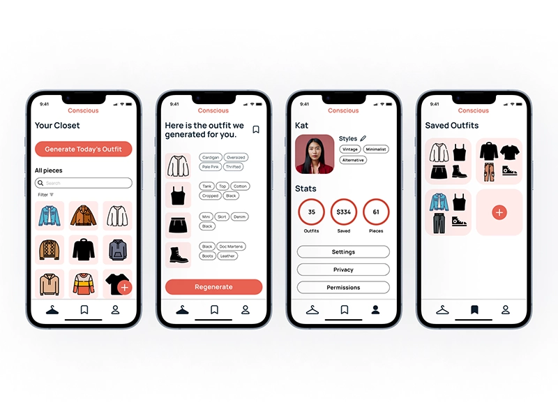
Outfit Generation
The app assembles outfits from your digital closet. Lock a piece you love, regenerate the rest, or save the whole look for later.
Adding a Piece: Automatic
Scan a clothing tag and the app automatically pulls in descriptors. Just verify and confirm to add it to your closet.
Adding a Piece: Manual
For items without scannable tags, manually select the type, style, size, and color. All details are stored and searchable later.
Saved & Profile Tab
Saved looks are always one tap away. The profile tab also shows wardrobe stats and lets you fine-tune your style preferences at any time.
Reflection
What this project taught me.
Conscious Closet never shipped, and that's part of what makes it worth reflecting on. A complete design cycle, from research through polished prototype, teaches you things that shipping on time sometimes skips. Three of them stuck with me.
Research Shapes Everything
The survey and archetype work were the foundation the whole design rested on. Skipping or rushing that phase would have produced a much weaker product.
Lo-Fi Testing Saves Hi-Fi Rework
Several assumptions that seemed solid, including the quiz card UI and a dedicated home screen, fell apart quickly in lo-fi testing. Catching those early saved significant time in the high-fidelity phase.
The Gap Between Prototype and Product
Getting a prototype to feel polished and real is one thing. The leap to a shippable product, covering engineering, infrastructure, and edge cases, is another entirely. This project deepened my respect for that gap.
Future Improvements
- Enhance clothing representation for better outfit visualization.
- Improve the flow for manually adding pieces.
- Expand functionality with a shopping plug-in that interrupts the impulse to buy before it becomes a purchase.