Overview
I started with a space problem. Research revealed a loneliness problem.
Traditional community gardens are land-hungry by design. In San Marcos, two local gardens together offered about 40 plots, each locked into a full-year rental. That model turns community gardening into a competitive sport most people lose before they start. I came in asking one question: could aeroponic tower systems fix the capacity math?
The answer was yes. But research surfaced a second problem. Beginner gardeners weren’t just blocked by waitlists. Once they got a plot, they were isolated. They didn’t know who else was gardening nearby, couldn’t easily ask for help, and had no reliable way to build the connections that make gardening sustainable as a habit. Solving access without solving community would produce an app that people joined once and quietly abandoned.
The app needed two jobs: eliminate the access barrier, then give people a reason to keep coming back.
40
plots available in San Marcos
200+
possible with aeroponic towers
400%
capacity increase
The challenge
Community gardens are built for people who already got in. Yearlong plot rentals, fixed footprints, and no digital infrastructure mean that most people who want to participate simply can’t, and the ones who do have no structured way to connect with each other.
The goal
Design an app that uses aeroponic tower systems to dramatically expand capacity, makes the reservation process transparent and frictionless, and gives gardeners — especially beginners — a real social layer that turns individual plot access into a shared experience.
Research
A 400% capacity gain was the easy part. What users actually needed was harder to see.
I started by visiting both San Marcos community gardens and talking to current gardeners and people on the waitlist. Then I spent time understanding aeroponic tower systems: roots suspended in air, periodically misted with nutrient solution, seeds planted in small foam inserts. Towers are vertical, modular, and far more space-efficient than soil plots. The capacity math improved dramatically on paper.
But those conversations kept returning to something the technology couldn’t fix. The most consistent frustration wasn’t “I can’t get a plot” but rather “even when I do get one, I don’t know what I’m doing and I have no one to ask.” Isolation was as much a barrier as access. An app that only solved the reservation problem would address the symptom and miss the condition.
What the research actually found
Community gardening's scarcity problem is visible. Its loneliness problem is invisible. Designing only for access would produce an app people joined once and quietly abandoned.
Three things had to be true for the app to work:
- Capacity. Aeroponic towers could expand available plots from 40 to 200 or more in the same footprint. The physical infrastructure had to be part of the product concept, not an assumption underneath it.
- Transparent access. A real-time reservation system with visible waitlist position would defuse the frustration that currently makes people give up before they start.
- Social infrastructure. A community layer, built as an architectural equal to the reservation system rather than bolted on, would address the isolation that beginner gardeners returned to again and again.
Empathy map
Before wireframing anything, I mapped what I was hearing. It gave the design decisions something concrete to push against.
Says
- "I wanted to start gardening, but there are no more available plots."
- "It's hard to know where to start."
- "I wish I could get help with gardening more easily."
Does
- Emails local community gardens regularly to check for open spots.
- Spends hours researching gardening basics independently rather than asking anyone.
Thinks
- Wants more social connections in their life.
- Thinks growing their own food would be good for them and the people around them.
Feels
- Frustrated by how hard it is to secure a plot.
- Anxious about failing as a beginner once they do get access.
User Archetypes
Two distinct users. One shared frustration, two different needs.
The research surfaced two distinct users. The Plot Seeker is blocked before they begin and needs the system out of their way. The Green Thumb got in but feels lost and needs people to learn from. Designing for one at the expense of the other would have produced a product that works for half the audience. That’s why reservation and community became equal tabs, not a primary feature with an afterthought attached.
The Plot Seeker
"I've been on the waitlist for eight months."
Behaviours
- Wants to garden but has no outdoor space. Lives in an apartment and depends entirely on shared infrastructure.
- Emails the garden coordinator regularly to check availability. Has learned to expect disappointment.
- Has mostly stopped researching technique. Why learn if there's nowhere to practice?
Core needs
- A reservation system that respects their time: transparent availability, honest waitlist position, no ambiguity.
- Real confirmation. Not just a receipt — visible proof they're in the queue and moving forward.
- Low friction from approval to first day at the garden: clear next steps, no dead ends.
The Green Thumb
"I have a plot. I have no idea what I'm doing."
Behaviours
- Got access through persistence. Feels isolated. Doesn't know the other gardeners and won't ask basic questions publicly.
- Spends hours on YouTube and Reddit researching gardening rather than asking the experienced people standing 20 feet away.
- Shows up to the garden, does their work, leaves. The community aspect is invisible.
Core needs
- Low-stakes ways to ask questions and get help from people with more experience.
- Visibility into who else is gardening nearby. Shared context, not just shared space.
- Tools that make skill development feel achievable, not overwhelming.
User Journey
From idea to community.
Mapping the user’s path across Idea, Prep, and Outcome gave the research a structure to work against. The actions and goals confirmed what I already expected. The pain points told me something I wasn’t expecting.
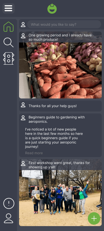
The Idea stage pain point is what gave me the community page. Users were overwhelmed by the amount of gardening information and had no one to ask. Not as a feature added to a reservation tool, but as a core reason to open the app at all. If someone could post a question and get a response from a gardener two towers over, that changes what the product is. It stops being a booking system and starts being a place people want to return to.
The other two pain points sharpened that decision. Difficulty finding relevant discussions in the Prep stage meant the feed couldn’t just be a chronological stream. It needed to be searchable and organized by topic. Limited interaction in the Outcome stage meant passive content wouldn’t cut it. The product had to actively surface conversations and make it easy to respond, not just broadcast.
Process
From sketches to a second pass.
The project moved through four phases: lo-fi wireframes to map the core flows, brand and visual system work to establish an identity, a first high-fidelity build to stress-test the design, and a refined second pass once I identified what wasn’t working.
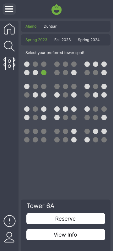
- Lo-fi wireframes: map the critical paths first. I focused the wireframes entirely on onboarding and plot reservation. Those are the two flows where getting it wrong ends the session before the app has proven anything. For plot selection, I took cues from how movie theaters sell seats: a map where users see the physical garden layout and choose a specific tower. That made the reservation feel real rather than abstract.
- Brand and visual system: community has to be in the mark. I explored several logo directions before committing to a sprouting plant with an embedded smiley face. The constraint I set for myself: the logo had to communicate the community angle without text, because it would appear as an icon at small sizes. The smiley had to be subtle enough to feel considered rather than cutesy, and the plant had to read clearly at 32px.
- High-fidelity v1: first build. The interaction held up and task completion tested well. But the visual design felt clinical and flat. It communicated utility without warmth, and warmth was the product's entire personality promise. The colour application was too timid, the type hierarchy was not earning its weight, and the UI read like a productivity tool. Shipping it would have been the safe call. I did not.
- High-fidelity v2: editing with a specific critique in hand. Having a precise articulation of what was wrong with v1 made v2 faster and more focused than the first build. I moved the navigation bar to the bottom for thumb reachability, pushed the colour system harder so the brand read as warm and intentional rather than default-green, tightened information density, and cut visual elements that were not earning their space.
Lo-fi wireframes
Wireframes focused on the two flows where getting it wrong has the most consequences: onboarding and plot reservation.

Early wireframes covering onboarding, map-based plot selection, and the home tab structure.
Brand & visual system
The brand needed to communicate warmth and community without leaning on clichés: no generic leaf icons, no sterile health-app aesthetic. I set a hard constraint: the logo had to work at icon size. That forced a level of clarity and intentionality that shaped the whole visual direction.
Seedling
#71b043
Mist
#f3f0f5
Spade
#454955
Shade
#0e0c0d
Primary
Secondary
App icon
Primary green logo, secondary black logo, and app icon.
High-fidelity v1
The first build had all the right structure and interaction. The visual language wasn’t there yet. These screens show where it landed before I went back in.
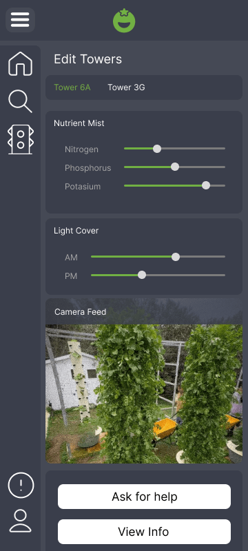
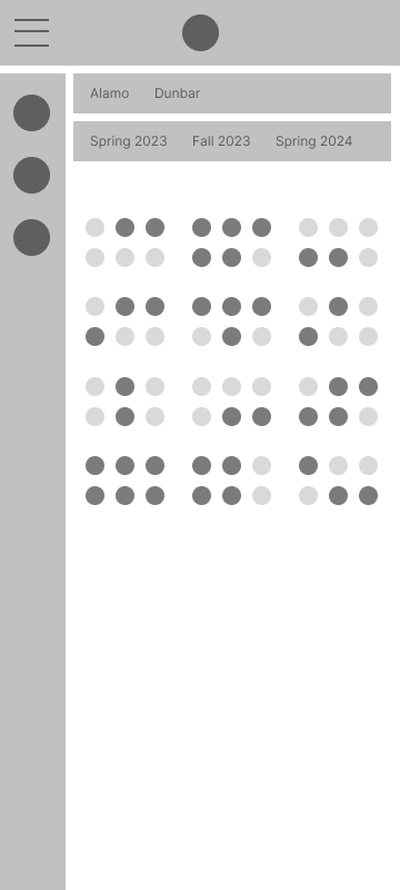
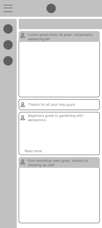
Sign-in, plot reservation map, community feed, and tower controls. First pass.
High-fidelity v2
The changes from v1 to v2 were specific: bottom navigation for thumb reachability, a colour system pushed hard enough to actually communicate warmth, and tighter information density throughout. Not cosmetic. Corrections to the gap between what the product said it was and how it felt to use.
Onboarding & Home
Onboarding flow and home screen: sign-in, community feed, and navigation.
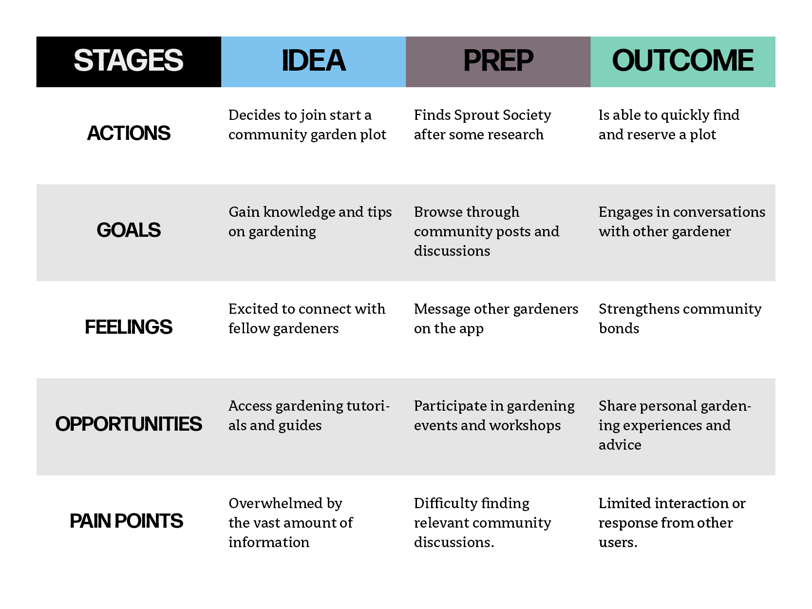
Plot Reservation
Map-based tower selection: choose a location, pick a season, reserve a spot.
Outcome
What I learned by going back and doing it again.
Sprout Society never shipped. There’s no conversion rate to report, no A/B test to cite. What I have is a complete design cycle from research through prototype, and the calls I made along the way. The one that mattered most: deciding, after a fully functional high-fidelity build, that the work wasn’t good enough and building it again.
The user test didn’t flag it. Task completion was fine. It came from looking at the work honestly and seeing that it communicated efficiency when the product’s entire promise was warmth. Those are opposite things. Shipping it would have meant putting out something that says “community” and feels like a scheduling tool.
The v2 rebuild was faster and more focused than the first because I went into it with a specific critique. A good v1 isn’t the one you ship. It’s the one that gives you enough information to build the right thing.
The invisible problem is usually the real one
The capacity constraint was obvious and quantifiable. I knew about it before I talked to a single user. The loneliness problem was invisible until I listened for it. Research that only confirms what you already suspect is research that is not doing its job. The community tab exists because I went looking for what I was not expecting.
Design judgment means knowing when to stop and when to go back
Finishing is not the same as being done. The first high-fidelity build was technically complete and tested well on task completion. It was also wrong in a way that mattered. Recognizing that, and being willing to say so clearly and specifically, is a skill that only develops through repeated honest evaluation of your own work.
Domain research is design research
Understanding how aeroponics actually works — the physical tower structure, the misting intervals, the nutrient solution management — made the tower control panel a natural product feature rather than a speculative add-on. Without it, you are guessing at features. With it, you have specific reasons for everything you include.
If this moved toward production, the first three things I’d validate:
- Whether richer plot visualization drives connection. The current map shows availability. A more useful version shows what's growing in nearby towers, which creates natural conversation starters between neighbours. I'd test whether that visibility actually increases social interaction, or just adds visual complexity.
- Whether the manual add flow scales. Adding a single plant is fine. Adding a full season's worth at setup is a different UX problem. I'd run a task test specifically on bulk-adding to find out where the friction lives before committing to a solution.
- Whether contextual shopping increases conscious purchasing or just purchasing. A real-time shopping integration surfacing relevant seeds and supplies could be genuinely useful, or it could undermine the "conscious community" positioning by turning the app into a storefront. That is a hypothesis worth testing before building.